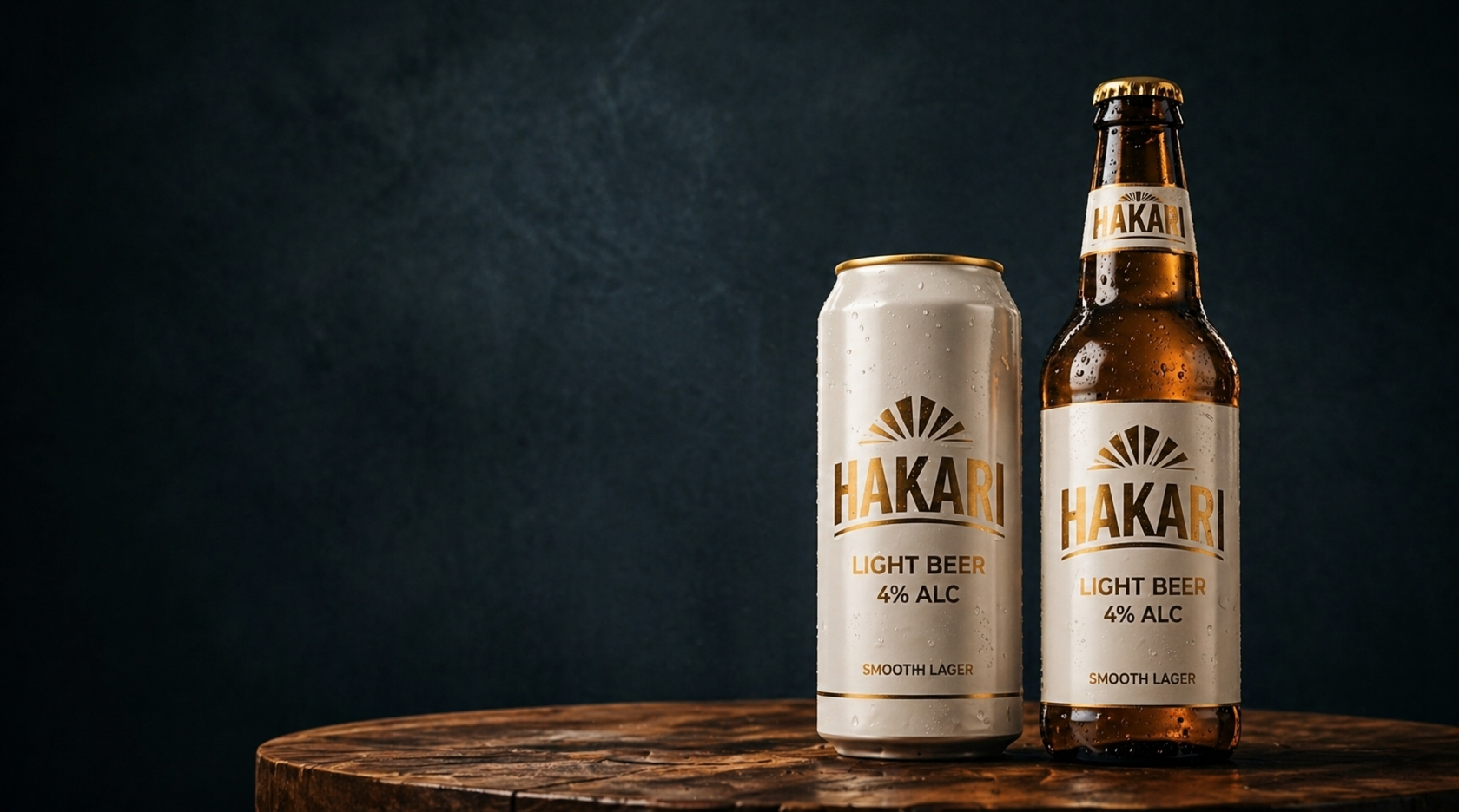
Hakari Light / Pilsner
German Pilsner visual language
The page now carries a beer-specific color system: Pilsner Gold, Hop Green, Foam White, Steel Blue. The styling is tuned to the flavor idea, not just the Light or Strong family.
Floral hopSnappy bitterBright malt
Style profile
German Pilsner for Hakari Light
pale, sharp and elegant, with floral hop aroma, firm bitterness and a clean malt backbone. The Light version frames this style through a bright, smooth, refreshing and approachable drinking occasion without announcing final ABV, pack size or launch date before approvals.
Beer-specific color direction
German Pilsner color and mood
Pilsner GoldHop GreenFoam WhiteSteel Blue
Light Beer pages keep the Hakari brand intact, but this Pilsner page now has its own visual temperature, liquid tone, accent color and sensory cues. The result is a more premium, more memorable page that still stays SEO-friendly and responsive.
Launch readiness content
Consumer education
Explains the style in simple language so first-time visitors understand the flavour direction, body, finish and likely occasion.
Distribution planning
Links visitors to contact and state availability pages, keeping product interest connected to trade enquiry and launch readiness.
Responsible marketing
Uses age-appropriate communication and avoids over-consumption claims. Visitors are reminded to drink responsibly and never drink and drive.